Artist Website

An ideated website for music artist, Tyler the Creator. The website includes sources to artist history, songs, personal life, tour dates, interviews, clothing brand, and the overall artist’s career.
The website would be for fans and music junkies to discover and learn more about the artist. This would be a perfect place for fans, individuals doing research, scouts, and future collaborators to learn more about Tyler the Creator and his work.

Role

UI Designer

Type

Digital Design

Year

2020

View Project

Executive Summary

Approach:  Applied lessons learned from Prototyping Challenges and applied it to the project.
​​Goals: To practice and showcase an understanding of basic prototyping skills and create a functioning interface. 
​Challenges: Ideating and designing an interface that has very few real-world examples for referencing and design. 

Introduction

Prototyping is a simulation or sample version of a final product, which UX teams use for testing before launch. The first stages of the project was focused on completing weekly Figma challenges that would be applied to the final stages of the project. 
​This project was not team-based, unlike most UX projects which allowed me to have complete control of the project.
Designing an interface is a trial and error process. It takes time, patience, and diligence, but the end product is worth it. 

Prototyping and Design

To begin with, my final product was nothing similar to what I began with.  Plenty of changes were made to the final draft and the one thing that remained the same was the document style and idea.

initial design idea

Having to prototype challenges created for a phone app, a lot of the challenges could not be translated to web design, or would not look cohesive. Therefore, in my best faith, I learned the challenges and merely applied them to my final design. 

Figma design challenges

When it came time to create the final draft, I started afresh but kept the components and variant interactions from the challenges in my User Library. This way if I needed an interaction that was useful in the challenges, I could easily transfer and edit it in my new document without having to create a whole new set of variants. 
I am extremely proud of my final design, especially it's aesthetic. I would gladly publish the webpage for other fans to browse through and learn more about one of my favorite music artists.

​Prototyping Process

Prototyping for a web page is less complex than prototyping for a phone app but requires more page space and room for design. I decided to follow the web design example set by Apple.

Their webpage is simple and to the point, with very few animations. I wanted my web page to be more informative and less interactive. However, I did include hyperlinks to the Artist's work and social media to make a connection and album discovery for the user much easier. Since the subject of the page is a real person, I did connect their actual social accounts to the web page. 
As for the Merch, History Album section, I had to do my research. The majority of my time was spent researching and including it in my work while adding a personal touch. I decided to create a page that is suitable for both fans and those who have no idea who the artist is. 
The navigation menu was easily created using Components. After creating a mother Component from 5 Variants & combining them, I proceeded to duplicate it and paste it onto the other pages. This saved time and ensured all the connections would be leading to the appropriate pages.
 

navigation bar

An interesting feature I also decided to add was a carousel of his past albums on the home page. This was achieved through using variants to create different instances each and every time the user would press click on the arrow button, therefore bringing up a new image and replacing the previous one with the latter.

Design Process

The design for the web page was inspired by a podcast page I had stumbled across. The page was aesthetically pleasing and had a fair share of images and information.

The color style was inspired by Tyler's "Flower Boy" album, which comprises of earth tone colors. Bright colors were used only on the home page while the rest of the site was compromised of more neutral and tone colors.

Often times the home page is the most visited and I spent most of my time on it to ensure it was an attractive landing page.
I used animations and images inspired by the artist's music and design, the website is a creative one therefore would be different from an eCommerce or portfolio website. The website is colorful, vibrant, and eye-catching. 
The font and text chosen were inspired by minimalism and are often used on websites. 


Auto Layout

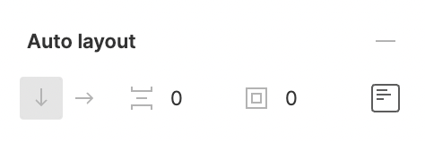
Auto layout is a property you can add to frames and components. It lets you create designs that grow to fill or shrink to fit, and reflow as their contents change. This is great when you need to add new layers, accommodate longer text strings, or maintain alignment as your designs evolve.
Auto - layout assists in editing and keeping components standard throughout the design. It makes prototyping easier and gives room for corrections without resetting the default conventions used in the document. It is a great feature in the Figma application.
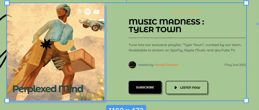
I mainly used auto-layout to position interactive frames and large images that might have needed editing during my creation process. In case of any changes the sizing of the frame would be proportional and cohesive throughout the website. 

auto layout in Figma

example of the use of auto-layout

Redlining

Redlining (or Redline) is marking up a UI design hand-off (like a mock or a wireframe) by literally adding red lines to indicate spacing and sizing of design elements. 

​Redlining is one of the final steps in UX design process, and it is done to communicate fine details of the design to development team or other team members who don’t have direct access to the source design files.

​In this case, we used the 8pt grid system to serve as a base for creating the prototype. This system is a commonly used convention in creating/prototyping for mobile apps and websites.


Outcome
In conclusion, the Prototyping Project was a great learning experience and created a space to learn at my own pace and really understand the basics of Prototyping.
I had a great time learning about the Figma software and more about prototyping during this period.

Other work

Want to create something awesome? Drop me an email.

→ almasigathoni@gmail.com